Every poster of our solar system is lying to you
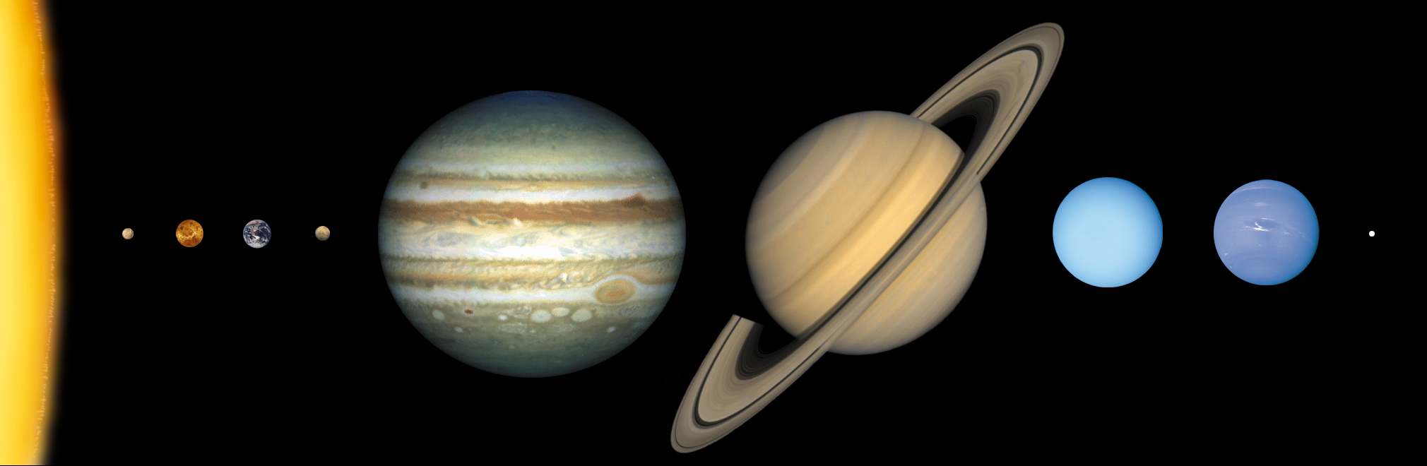
Credit: NASA/Lunar and Planetary Institute
Every poster of our solar system is lying to you. Not with bad facts, with an impossible drawing.
This article contains affiliate links. If you buy through them, we may earn a small commission at no extra cost to you.
Almost every picture of our solar system you have ever seen, printed poster, textbook diagram, phone wallpaper, video animation, gets two things wrong at once: how big the planets are next to each other, and how far apart they actually sit. It is not really the posters' fault. The truth would not fit inside any single image, on paper or on a screen.
The size problem
The Sun is so large that it could swallow roughly 1.3 million Earths inside its volume. Jupiter alone could hold more than 1,300 Earths. Most illustrations shrink these differences down until everything looks like it belongs on the same page, which quietly erases just how radically different the Sun, Jupiter, and a small rocky planet like Earth actually are from one another.
The distance problem, which is worse
Distance distortion is the bigger issue. Picture shrinking Earth down to a small marble, about a centimeter across. At that scale, the Sun becomes a ball roughly a meter wide, and it would sit about 118 meters away from that marble, more than a football field's length. Neptune, on the same shrunken scale, would be more than 3 kilometers out from the Sun.
No poster, no diagram, and no video frame can show a meter-wide ball and a tiny marble sitting three kilometers apart while keeping both of them visible at the same time. So every depiction compresses the distances down to something that fits a rectangle. That is a reasonable design choice. It also means the picture in most people's heads is a solar system that looks comfortably crowded, when the real one is almost entirely empty space with a handful of small objects scattered unimaginably far apart inside it.
This isn't just an old-poster problem
It would be easy to assume this is really about physical posters being outdated, printed years ago with whatever information was current then. That is a separate, real issue, and it shows up clearly with Pluto: older printed posters usually show it as the ninth planet, because that is what it was considered until 2006, when the International Astronomical Union formally reclassified it as a dwarf planet after the discovery of several similar-sized objects in the outer solar system. Newer posters and diagrams generally drop it from the main planet lineup, or mark it separately. That specific disagreement is a genuine update in classification, not a trick of scale, and it is worth knowing about on its own.
Enjoying this story?
Get a short teaser by email whenever we publish something new. No spam.
But the scale problem is not solved by using a brand new poster, or a video instead of a poster, or a phone screen instead of print. Every single-frame depiction of the solar system anywhere, no matter how recent or how it's displayed, faces the exact same limit: you cannot fit both the correct relative sizes and the correct relative distances into one fixed-size image and have anything be visible at all. It is a math problem, not a printing or format problem, and it applies equally to a poster from decades ago, a video published today, or whatever comes next.
How anyone knows the real numbers
None of these figures are estimates dressed up as facts. Planetary diameters and orbital distances are measured through centuries of astronomy, refined today with radar ranging and spacecraft tracking, and published by agencies including NASA and confirmed independently by observatories worldwide. Shrinking those numbers down to a marble-sized Earth is simple arithmetic, and anyone can redo the calculation and land on the same distances.
The clearest proof that this isn't an exaggeration comes from physical scale models built at real, walkable size specifically because only genuine physical space can honestly show size and distance together. Sweden's Sweden Solar System, the largest scale model of the solar system in the world, spans real kilometers of ground between its planets. The Voyage model on the National Mall in Washington, D.C., does the same at a smaller scale. Both exist because their builders concluded that no single image could ever make the point.
Why it matters
A compressed, crowded solar system in your head shapes how you imagine everything about space: it makes the gap between planets feel like a short hop instead of a months-long spacecraft journey, and it hides how isolated each world in our solar system actually is from its neighbors. None of that makes posters, diagrams, or videos dishonest on purpose. They are solving a real design problem the only way that's possible: pick a scale that fits the frame, and let something give. Once you've done the marble-and-football-field math yourself, or seen a real scale model stretched across actual kilometers, the tidy, crowded picture stops feeling accurate again, and that shift is the entire point.